Another year, another aggressively different design landscape to keep up with.
Well, maybe not so much this year. The design trend projections for 2023 can pretty much be summed up as “nostalgia with a twist” with very little deviation. People are leaning into their comfort zones more than ever, whether that means relying on a design aspect that’s been “in” for a few years that they still like, or want to be reminded of their 2006 MySpace page. Whatever it is, for better or worse, there are going to be a lot of familiar concepts and we’re ready to review them based on their accessibility merit!
1. Retro
Two trends absolutely dominated the projections this year. People are absolutely barreling into the comforting bosom of “retro” design.
We mentioned retro in a previous design trend post a few years back, but back then it was all about sepia, 50’s diners, and old west typeface. But for 2023, this refers to the golden age of web design: the 90’s.
Memphis
Abstract and brightly colored, Memphis designs dominated the 90’s and were plastered on everything from notebooks and paper cups to arcade carpeting and bus seat upholstery. At this point, web design seems like a natural progression.
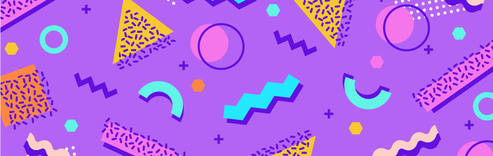
From an accessibility perspective, it really depends on how you implement a Memphis design. It’s A LOT to take in and the last thing you want to do is overstimulate your users or make your content hard to absorb.
If you’re drawn to the squiggles and geometry of Memphis design, we encourage less is more. These can make for some really great accents, but don’t force your users to go searching for your content in a mess of squiggles and triangles.
90’s Typography
The 90’s boasted itself as rad and extreme, and nothing emphasized that more than its typographical trends. In case you weren’t there, many of the fonts popularized in the 90’s were intended to be reminiscent of something carved into a school desk (like Boardslide and Misfit) or a font that had been previously struck by lightning (like Thunderstorm). The 90’s were also well-known for realistic hand-drawn fonts (like the permanent marker aesthetic of Wasted Youth or the bored in class doodling of Truant).
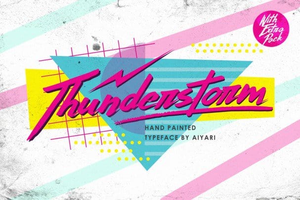
Besides the 90’s, all of these fonts have something else in common: They’re incredibly difficult to read. By overusing them, you’re forcing your users to think harder just to read your content (which is, ironically, the exact opposite vibe of the 90’s). Keep in mind, we were still being taught cursive in the 90’s, so we could read fonts like Starlit Drive. Cursive hasn’t been required curriculum since 2010 (at least in the United States), so your retro content may be even more lost on a younger audience if you overuse these hard to read fonts.
Animated cursors
Yes, you heard that right. We were extremely surprised to see, of all things, animated cursors were making a come-back. These have been the butt of web design jokes for the last two decades and it’s hard to figure out if this is nostalgia gone too far, a trend birthed from “I’m doing it ironically,” or a 20-something-year-old thought they were the first person to do it and it just caught on.
Examples include the traditional something (like sparkles) trailing behind the cursor, replacing the cursor entirely with a graphic, and transforming the cursor on-click or in lieu of a hover effect. These are all terrible for accessibility. They can be extremely distracting for many users. Other times, they’re difficult to see (like the frequently seen 3px by 3px minimalistic dot) and override local system settings users have for their own cursor (like size and color). You could be overriding someone’s accessibility setting which provides an extremely poor user experience for some. At the very least, you should provide your users with the ability to turn off the custom cursor.
Our Accessibility Maintenance Plans help you remove barriers for people with disabilities and meet legal requirements with confidence.
2. Micro-interactions and animations
The other dominating trend this year are micro-interactions and animation. These are both umbrella terms for a wide variety of movement, many which overlap. But designers are doing their best in 2023 to make websites feel like they’re living and breathing, while trying to remain in the spectrum of accessibility.
Interaction indicators and animations have been around for a while now. Lottie animations have been providing users with an easy way to implement movement on a page have been rapidly gaining popularity the last few years. The primary difference between animations from previous years and 2023 is simply subtlety. With accessibility steam rolling onto the scene as an official trend last year and animations often being a risk factor, it seems like this year we’re splitting the difference. People aren’t quite ready to let go of their movement, but they have agreed to tone it down a bit. Softer, gentler, and more subtle, animations this year will be much more low key. While this is a drastic improvement over flashing gifs and ultra-fast animations, some users could still find the subtle animations distracting. Just keep that in mind and consider implementing a “disable animations” feature for your users.
Micro-interactions are short, small animations that are user-triggered in some way. This could be an icon button (like this hamburger menu icon), a link, or hovering over an element of the site (like this little tea icon by Andreas Storm, pictured above). These little interactions could be accessible as long as you keep your users in mind. For example, this user interface animated icon collection will only animate on hover, despite the links themselves being keyboard navigable. Ideally, they’d activate on focus also to provide an equal experience. We’ve also seen hover effects on non-user elements (such as unlinked images, headings, decorative icons, and so on). You’ll want to be careful doing this. Keyboards can only focus on user elements such as input fields, links, and buttons and would be unable to trigger an animation given to a non-user element. So just ensure those interactions don’t provide any additional information some users won’t have access to. And don’t make them abhorrently nauseating like the wormy scroll. Please, we’re begging you, don’t implement the wormy scroll on your website.
3. Illustrative design components
Vector graphics and illustrated components are projected to become more prominent in 2023 in lieu of images. As we’ve mentioned in the past, the accessibility of this trend entirely depends on how it is implemented. For example, you could have illustrated layered components, like Mario Duarte’s “The Dark” or the Firewatch (the game) website, both of which have soft animations. However, the last thing you want to do is turn your website into an aggressive pop-up book kaleidoscope. Slower animations that don’t require custom scrolling, include rapid flashing or fast changes of color, or drastically slow down sites are optimal.
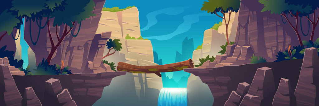
In terms of vector graphics, just remember to still implement alt text to convey its intention and don’t overlay low-contrast text!
Honorable mention: Claymation
We saw on Claymation mentioned on a couple posts, so it is worth mentioning. Claymation and clay-styled vector graphics are apparently going to be popular in 2023. Accessibility-wise, claymation videos should follow existing Web Content Accessibility Guidelines (WCAG) standards for videos. This is another example of 2023 being the year of nostalgia-inspired web design.
4. Minimalism versus overstimulation
While minimalism is making the list for another consecutive year, “overstimulating” design is quoted by a few outlets to be a prominent design trend for 2023. Also dubbed “anti-design,” overstimulated web designs are a complex mishmash of nonsensical elements thrown together. These sites often make users wonder if the stylesheet is broken, their monitor is on the fritz, or if they somehow ended up on someone’s acid trip memoir.
Web design is an art form, no doubt. And most art is a reflection of the artist’s emotions. It’s inevitable that a designer having an existential crisis decided to upload every asset possible into Figma and submit it as a final product only for the client to love the chaotic aura and provocative feeling it evoked.
However, it’s no surprise that this design trend brings with it extreme accessibility hurdles. From overwhelming distractions, constant color shifts, non-existent reading order, and auto-playing music, an overstimulating web design is a good way to ostracize a huge group of potential users as it potentially provides hurdles for every major classification of disability.
It’s one thing if you want to create an anti-design project for personal use as an art piece itself, but if you’re a business or providing important information, this trend should be avoided entirely.
5. Neomorphism
Neomorphism is essentially “New Skeuomorphism” and intended to be a futuristic take on familiar objects, primarily soft buttons. However, there’s nothing really new about it. Neomorphism has been tearing apart the web design community for years now. Some users find it to be a refreshing change to standard web design, while others point out its more obvious accessibility flaws.
Neomorphic design tend to be very low contrast and subtle, depending on soft shadows to separate elements from each other. Unfortunately, these soft shadows often aren’t enough to define user elements well enough and when combined with low-contrast text, this makes for a very poor user experience for those with low vision and cognitive impairments. Not to mention one of neomorphism’s most well-known drawbacks is becoming entirely unreadable to anyone using a phone in daylight as the brightness causes already hard to see distinguishers to become invisible entirely.
There are four major categories of Neomorphism:
- Lightest (the traditional style with non-existing contrast on all elements)
- Light (bounding boxes are still non-distinguishable, but text is make darker)
- Dark (an inverted dark mode)
- Neon (dark mode with user elements emphasized with bright colors)
We’ve sampled each of them in this example (disclaimer: the elements used here are intended for display purposes and are not functioning; none of the samples are intended to be an example of accessible neomorphism):
A tiny line of text
Some more short text
A tiny line of text
Some more short text
A tiny line of text
Some more short text
A tiny line of text
Some more short text
The problem with Neomorphism is that it requires users to focus harder on your website to find user elements, which is very strenuous to the eyes. And since all of the elements are skeuomorphicly button-like, you website becomes a game of “can I click on that” hide-and-seek. Not to mention many neomorphic designs disable accessibility optimizations, such as focus indication and outlines, to preserve the smooth aesthetic.
If a designer absolutely must create a neomorphic design, the safest bet is probably dark or neon. The light modes intentionally emphasize subtlety, so when color is used it is still likely a light color accent on the light background. Dark and neon often use a lighter color accent on top of the darker backgrounds, making it stand out more. Neon goes a step further by usually adding more accents to user elements, drawing the eye to them as if to say “click me.” Which is exactly what you want from your users.
Neomorphism may look sleek, but it’s a dangerous game to play, not just for user experience but for user conversion. Most websites have a call-to-action (CTA) and this is usually an element that intentionally stands against the rest of the site and helps define the purpose of a website or makes things easy to find (shop, contact, donate, etc). Neomorphism by nature does not give any site element precedence over another – it’s intentionally uniform and, ironically, while trying to be unique, creates a monotonous experience devoid of idiosyncratic elements we all depend on to efficiently navigate websites. By removing element individuality, you lose users in a flat ocean of undecipherable user elements. It’s entirely impractical and after the initial ohh-and-ahh, becomes a frustrating experience for users actually trying to use your site. You can still add neomorphic elements to a site, but use them as accents, such as a content block wrapper, and not for user elements.
Returning design trends
There are many trends back again we’ve discussed in the past, such as gradients, dark mode, and parallax scrolling. We won’t go on another rant about parallax scrolling. Instead, check out some of our previous articles:
- Fifteen Design Trends from an Accessibility Perspective
- Accessibility and 2022: 13 Design Trends From a Usability Perspective
Conclusion
Ultimately, we might not be seeing anything new or groundbreaking in 2023 on the design-front. People are looking for comfort this year, not to blaze any trails. And that’s OK! Some days we want to click Netflix’s “Play Something” button, excited about something new and random. And other days, we want to re-watch our favorite comfort show for the millionth time. Design trends ebb and flow and recycle themselves, it’s in their nature. And design trends aren’t set in stone – we still may see something new and exciting this year that hasn’t been projected.
A concerning trend we did notice while researching this article is accessibility rebellion. Accessibility is finally getting into the spotlight, which is cause for celebration. And while it shouldn’t be considered a “trend,” it has made the list for design trends the last two years. However, as many people in the accessibility community are aware of, there are still a lot of people out there who refuse to learn how to design inclusively. This seems to be resulting in designs that are intentionally un-inclusive to make a statement (such as anti-design/overstimulation). I’ve seen individual designers on Twitter act out against accessibility, but to see this childishness on such a grand scale is troubling to say the least. We just hope they get it out of their system, take a little nap, and wake up ready to realize accessible design is not a hinderance to anyone’s artistic ability but is providing a platform to create beautiful things no one has ever seen before that are usable by everyone. Accessibility rebels aren’t standing up for artistic venture – they’re simply proving they don’t have the capability to provide beauty and usability which is resulting in these anti-design tantrums, which is a shame. We like to think they can do better.
Web design is exciting and a fantastic vision of peoples’ creativity. There’s nothing like creating something beautiful with the confidence it will be usable by all people and benefit a client’s business. While the projections for 2023 are a reminiscent of Pandora’s jar, true to the myth we are still left with hope. As more and more people recognize the need for accessibility as we progress, the more usable designs and design trends we’ll be seeing (and just because they’re not predicted right now, doesn’t mean they won’t happen). After all, accessibility benefits SEO and usability for ALL users, and reduces user frustration and bounce rates. It’s not only the right thing to do, it’s just good business. So when designing new sites this year, just keep in mind the more accessible your website is, the more users have access to it resulting in a higher potential of profit and/or user conversion.
Need help on your
accessibility journey?
AccessiCart offers accessibility maintenance plans for your website. Remove barriers for people with disabilities, widen your audience and meet legal requirements with confidence!