
We’re finally here: 2022. The last couple of years have really put us through the wringer. People were working from home, Zoom went from being a thing only some people knew about to being a household application, and middle-aged teachers had to learn how to use Discord to create a digital social classroom environment. It’s been wild. And believe it or not, COVID-19 had a HUGE effect on web-based trends for this year (and probably quite a while after that).
While doing research for this article, we found it very interesting that many of the up-and-coming “web design” trends are actually web development trends (meaning people seem to be more interested in new functionality over new design). Both design and functionality affect accessibility, so in this post we’re going to review which of the most popular 2022 web design and development trends will be the best to emulate for a universal experience.
What is our favorite 2022 web design trend? Accessibility.
This one is easy. Yes, our time has finally arrived. On almost every “Design Trend” blog post out there, Accessibility makes the list and we are THRILLED! However, this has also brought an influx of questions: what does that mean? How the heck do I make my website accessible? Why should I?
If you don’t already know, web accessibility is creating a digital environment optimized for those with disabilities (often interchangeable with “Universal Access” which is an environment that can be used by anyone regardless of circumstance). While accessibility most commonly benefits those with disabilities and those who use assistive devices to navigate websites, it actually creates a better experience for everyone simply by taking people and situations into account. For so long, websites were created with the idea in mind that a person was sitting in front of a computer; then, it evolved to take smartphones into account. The next step in digital evolution is to shed assumptions and expectations altogether. A person may not have the newest technology, may not be in an ideal setting (for example, on their phone in the bright sun), or may not use a device the same way you do. Making sure your video has subtitles doesn’t just help someone who is deaf, but someone who forgot their headphones and doesn’t want to blast their audio in public. Making sure your heading hierarchy is properly nested doesn’t just help someone using a screen reader who uses headings to navigate a website, it helps your Search Engine Optimization (SEO) and makes your site more discoverable.
So how do you make your site accessible? Well, there’s not really a single easy answer. Educating yourself would be the first step. There are a lot of people and agencies out there who are suddenly accessibility experts who are still pushing out wildly inaccessible websites. So if you’re looking to get your site optimized for accessibility, you’ll want to know what you’re looking for by learning from reputable sources like Deque and WebAIM. It will help you figure out the sheep from the wolves to protect yourself and ensure your website truly is universally beneficial.
Accessibility overlays are NOT the same thing as being accessible
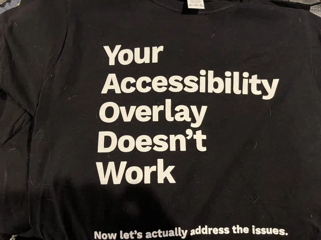
Accessibility overlays have become quite popular in recent years. But, let’s be clear: this is NOT the same thing as being accessible. Overlays are like putting a band-aid on a surgical incision and they often cause more issues than they prevent. The only way to be truly accessible is by addressing the issues at their core: making sure your website’s code is accessible and making sure your content is also.
2022 color and aesthetic trends
This year more than others, web design trends seem to be very parallel to modern interior design (probably all the additional HGTV we’ve all been watching over the last couple of years). More and more, clients have been showing up with Pinterest mood boards and talking about the “feel” of their site. We should be prepared to see more of this through 2022 as people begin treating their web design project as they would a home renovation project.
Bold Colors: accessibility in technicolor
We are thrilled about this one! We’re huge fans of really bold color schemes. And this trend has the potential to be great for accessibility by creating high contrast visuals. Of course, as we have advocated before, you must ensure your bold pops of color have enough contrast by using a tool like WebAim’s Contrast Checker, especially if your bold background colors are orange, yellow, or range into neon.
This design is not
accessible…
…but this one
totally is!
Gradients: blurring the design trends of the past and future
There is nothing new under the sun, and this includes web trends. Gradients have come in and out of style so many times it’s hard to keep track, but this year they’re back in and much fresher.
gradients then (this is a visual example of an outdated gradient design)
gradients now (this is a visual example of a modern gradient design)
The only downside is it’s harder to automatically test gradients for accessibility. Anyone who has ever run an automatic accessibility scan knows text on images and gradients require manual testing because it can’t tell what the actual background color is. So, when using gradients behind text, make sure the colors you’re using meet minimum contrast requirements.
Mood aesthetics and complex color theory: feeling blue?
Color theory tells us that there is a psychology behind colors. Certain colors affect moods, make you feel things, or encourage you to take a specific action (stoplights, for example). And this is true for design, both digital and physical. Ad and marketing agencies have been using color theory for decades, and apparently, the Internet is starting to catch up. The fact is, most designers use color theory when creating websites and logos and now we’re hearing clients use it when making requests.
This can actually be good for accessibility under specific circumstances. For example, if you’re creating a website for people with anxiety, color theory suggests using blue or green will have a soothing, calming effect (but you probably don’t want to use red, as it can evoke excitement or agitation). Knowing the effect colors have on people isn’t just important to your viewers, but to your business, as the colors you use could leave an impression on your audience you don’t want. We always tell clients the color scheme they want isn’t about what their favorite color is but how they want their business to be perceived.
Hamburger menus on desktop: no thanks, I’m full
Hamburger Menus are collapsed menus often seen on mobile devices represented by three parallel lines (☰); not to be confused with a kebab menu icon (⋮) often used as an “additional options” or “overflow” sub-menu. More and more, the hamburger menu is beginning to appear on sites to hide the full menu even on desktop (the Awwwards website, for example). While becoming a quick favorite for websites with a minimal aesthetic, this is not a good development for accessibility for many reasons.
The most obvious reason is people simply aren’t used to looking for the hamburger menu on a desktop, which falls into a temporary accessibility grey area. This could be argued that all new things take time, but at what cost? By hiding your menu or making it difficult to find, people are potentially missing what you have to offer by overlooking a tiny hamburger shoved into a corner. This can hurt your website’s viewership just as much as it annoys your users. In an older 2014 study (Hamburger vs Menu: The Final AB Test) and a newer 2019 study (The Hamburger Icon: Does It Help or Hurt Revenue?), the author’s test site interaction analytics using different menu display methods. While both independent and run on single websites, it was concluded both times even just adding the word “Menu” along with the hamburger (Menu ☰) can significantly improve user interacting, implying the standalone hamburger still isn’t obvious to most. It’s also important to note, both studies were done using mobile analytics where the hamburger menu is, hypothetically, more recognized as a menu icon.
The second reason is access. Hiding your menu behind multiple clicks is creating more tasks for keyboard users to simply navigate a website.
This also leads us into reason three which is improper implementation. We’ve tested a lot of desktop hamburgers and most of them were aggravating beyond words. Here are some examples of our findings:
- Implementing a hamburger menu with display:none meaning screen reader users can’t access the menu items using their software element lists (forcing them to jump back into the menu and perform more tasks to navigate)
- WordPress developers who clearly weren’t aware of a theme’s “Skip to Navigation” hidden link and not implementing the correct IDs on a custom hamburger menu rendering this quick-link useless
- No keyboard shortcuts to close a modal hamburger menu (and sometimes no “Close” button, with the idea a user can close it by clicking anywhere off-ment – this creates an endless loop of focus within the menu for keyboard users)
- Incorrect Menu button aria text, meaning a person who is visually impaired could miss the menu altogether if all they hear is “clickable button”
- Incorrect reading order so a keyboard user can’t actually get into the menu without tabbing through to the end of a webpage and starting over (or back-tabbing through their browser)
The full list of annoyances is a lot longer. We’ll be steering clear of the desktop hamburger and will be choosing to make content easily available to users. If you truly must make your main menu a hamburger on desktop, at least add the word “Menu” and ensure you’ve followed the correct steps to make it accessible.
Mobile experiences: responsive responsibility
Responsive websites aren’t new; however, global web traffic is now being dominated by mobile devices at over 50%. This means designers are starting to prioritize mobile over desktop. For accessibility, the trend in and of itself is neither a good nor bad thing. However, just like with desktop, accessibility needs to be kept in mind. For example, clickable elements should be minimum 40px by 40px – this accounts for those who may have a motor disability and struggle to accurately click on small elements (or anyone who may have the shakes due to being a bit chilly). A fun test you can do yourself to ensure your website is easily navigable on a mobile device is by pulling it up on your phone and trying to use it with your elbow instead of your fingers! If you can successfully do this, it’s a good indication your website won’t frustrate your mobile users (good luck with the tiny Close Xs on ads).
Custom scrolling: accessibility in a parallax universe
Augh. Can we be done with custom scrolling, please? We think the expected reaction of parallax scrolling has always been “Ohh and ahh” when, in reality, more than a few users find themselves reaching for Dramamine.
Whether they’re animated beyond necessary (like Cann Social Tonic) or they hi-jack your scrolling making you wonder if you’re still scrolling or if your mouse batteries died (like this Peter Lindbergh dedication site), or they require mouse interaction (like Diesel: BAD Guide or the Delassus Group), custom scroll effects have been one of our least favorite attempts at design innovation in the last decade. Additionally, did anyone else notice how long these sites all took to load? Amusing, considering one of the biggest trends for 2022 is fast site-speed (we’ll touch on that later).
New technology and new design innovation are amazing, but custom scrolling isn’t a friend of accessibility and often creates hurdles even for those without disabilities. Between being nauseating, rarely fully keyboard accessible, and extremely slow, we wonder how they got this far. From an alternative standpoint, it will be interesting to see the lifespan of weighty custom scrolling post-COVID. With more people realizing they can move anywhere and work from home, this will likely mean cute little rural areas becoming more populated and they’re not exactly known for their swift Internet connections: will this slow-loading and obnoxious trend be replaced with a more functional and accessible alternative? We can only hope so.
Interactivity, dynamic content, and visual data
According to the polls, polls are trending! Yes, everyone wants their opinion known which has resulted in polls, quizzes, and interactive graphs cropping up more and more. While site interactivity is an umbrella term for elements that encourage user engagement, it means a lot of different things for accessibility. For example, you can make a quiz or poll accessible simply by ensuring it meets accessible form standards. However, things like graphs or other data visualization get much more complicated and follow vastly different rules than an embedded image of a graph. This doesn’t mean this trend is inherently bad for accessibility as long as developers of dynamic/interactive maps, graphs, and charts take the steps to make their work accessible. This means mapping data to labels and ensuring it’s easily keyboard navigable. For example, Highcharts has accessibility features available for their dynamic charts by adding keyboard navigation and screen reader support. It’s not perfect, but it’s a heck of a lot better than the “frame blank” or “object” a screen reader will interpret from a lot of dynamic graphs that are popping up.
As with everything: if you want your content to be seen by everyone, you must make sure it CAN be seen by everyone (especially if that someone depends on a screen reader to do so).
Voice Search Optimization: can you hear me now?
Voice Search Optimization (VSO) has been in the works for years now and has gone from a luxury (“Alexa, what’s the weather like?”) to an in-demand feature as COVID-inspired touchless interactions are sought after.
This is AWESOME news for accessibility, allowing those who depend on keyboards to skip that step altogether. However, now more than ever, it depends on content creators to write in such a way that makes it accessible. The “rules” are very similar to those of SEO, as are the benefits! The Search Engine Journal has a great article on VSO/SEO optimization. We also encourage you to listen to this “How I Built It” podcast episode featuring Chip Edwards called “Why you need to be on voice search” to learn more (a transcript is available on the episode page).
SEO and local SEO near you
While SEO has always been a priority for many people, now more than ever people want to be found. This is great for accessibility because it means more people are focused on proper syntax (proper list and table structures, heading hierarchy, easily searchable phrases, etc). People have been doing a lot of Googling over the last couple years so the competition is fiercer than ever.
Places are starting to open back up, but some don’t want to go far from home. Some people have decided to stay home, but man do they want some food delivered but from where? Localized SEO is more important than ever and that means optimizing your website for it. Localized SEO is basically adding the phrase “near me” to any inquiry and you will want to make sure your business appears on that list. This boosts your accessibility by making you more available. Imagine a dad walking their kid down the street for some ice cream, a person in a wheelchair who doesn’t want to travel too far for groceries, or someone who needs to find an urgent care close by – these are all examples of how local SEO could benefit people AND your business. Our friends at Yoast have a wonderfully informative article about Local SEO if you’d like to learn more. If you’re already a Yoast user, be sure to check out the Yoast Local SEO plugin and get your name out there. After all, accessibility is all about making sure your website is available to everyone; and sometimes, that starts in your neighborhood.
Site speed: websites swift as the coursing river
In a rapidly evolving environment like the Internet, you need to think fast and so does your website. People don’t want to wait for a slow-loading, feature packed site anymore when they can get the information they seek much more quickly from another source. So, where does accessibility come into play here? Easy: Availability and reduced frustration. By making your website fast-loading, you make it more available to those who don’t have high-speed Internet, have an older mobile device or desktop machine that’s not loading the way it used to, or couldn’t afford to buy the top-rated router available. Additionally, we’ve all been aggravated by websites we need to access that load at a snail’s pace. Ensuring you have a speed-optimized site is a quick way to reduce your users’ general frustration, giving them a more enjoyable site experience. Remember to keep site-speed in mind when considering other conflicting trends known to absolutely destroy it (like 3D graphics and custom scrolling).
The 2022 design pseudo-trends
Not everyone is going to agree on what’s trendy, and that’s OK – the world is a big place, after all.
Here we quickly touch on trends that not everyone agrees are “in” this year but still deserve to be mentioned.
Chatbots: How can we help you today?
Even on smaller websites these days, you’ve probably seen a little “Can we help you?” chatbox. Some of these are controlled by artificial intelligence (AI) with advanced learning and phrase interpretation to provide answers, some are simply contact forms so someone gets back to you later, quick-access to frequently asked questions, and others actually get you in touch with real people. But what do they mean for accessibility?
Chatbots could be a valuable asset if they’re implemented correctly. Some websites have thousands of posts on them and what can feel like thousands of pages to wade through when you’re looking for one specific piece of information. However, some chat-bots create keyboard traps, are totally inaccessible via keyboard, or don’t supply the information needed causing your user unnecessary frustration. If accessibility is taken into account and tested for before you invest in one (as most of these chat-bots are controlled by third-party companies and embedded on a website as opposed to created in-house), you could be supplying your site with a valuable feature. Keep your users in mind and how and why they might be accessing the chat-bot. After all, the last thing you want to do is give your users the digital equivalent of yelling “Operator!” into the phone while repeatedly hitting zero after having heard the menu options for the dozenth time.
Touchless interactions: don’t stand so close to me
This trend goes beyond the scope of the web but still affects your website and your business (and, yes, accessibility). While stores and restaurants are opening back up, no one wants to touch anything. You’ve probably seen QR codes popping up all over the place, replacing physical menus, brochures, and even business cards. This allows people to access your materials digitally from their phone, so it’s up to you to make them available and mobile responsive or you could see a decline in your business. Yes, this is considered situational accessibility and we are ALL on the receiving end of it (a humble reminder that accessibility doesn’t just affect those with disabilities).
Here we go again: previous design trends that are still trendy
It’s not uncommon for trends to stay “in” for long periods of time. In 2022, you can still expect to see the following:
- Dark mode toggle
- White space
- 3D graphics
- Vintage aesthetics and typography
- Hand-drawn elements
- Minimalist design
We’ve covered these trends before, but if you need a refresher you can pop over to our previous Fifteen Design Trends from an Accessibility Perspective blog post and read about their effects on accessibility there!
RIP: Previous trends that are no longer trendy
Video backgrounds: how do I stop this thing?
As minimalist design and speedy sites are in overwhelming demand, video backgrounds are, thankfully, becoming a thing of the past in favor of fast-loading word-only hero areas and bold text. Video backgrounds were a pain; not only did they demolish site speeds, they were often not compliant with WCAG 2.2.2 success criterion. They were distracting and would often change backgrounds making any text on top unreadable. We say good riddance to video backgrounds!
Overcrowded menus: how many sub-categories do you really need to display?
Once upon a time, it was perceived that the more jam-packed your menu was, the more you had to offer. With attention spans at an all-time low and hundreds (or thousands) of competitors with much more streamlined content, people are saying goodbye to overcrowded and complex menus and hello to minimalistic single tiered menus of just the important stuff, creating a much more cohesive site experience. This isn’t just good for accessibility but for everyone – no one has time to sift through a million sub-menu items (especially if you’re navigating a site via keyboard).
Sliders: two slides is too many
Keyboard users rejoice! It’s official: sliders are dead. Sliders, wherever they may have appeared on your site, were huge hurdles for many users. Between being on too short of a timer to actually read anything, lack of keyboard controls (or keyboard traps), and often a lack of decent color contrast or alt text, We’re shocked sliders made it this far. Trust us slider fans, don’t be sad about this. Statistically, users would rarely get past the first or second slide, meaning you can now focus your energy on creating content they WILL see instead of putting in all that hard work for your upcoming potluck or sale slide that will ultimately be ignored.
Conclusion: do I have to choose between accessibility and design?
The fact is, being accessible doesn’t mean your website has to look like a bland, bare-bones homage to Windows ‘95. All it means is you must take people and situations into account. It does take a little extra effort, but that extra effort helps your site reach the 15% of the world that inaccessible websites can’t (that’s approximately one billion people).
Our dream is to demolish the stigma that accessibility only benefits someone with a disability. Creating a more universally accessible world, both physical and digital, benefits EVERYONE now and in the future. We’ve all been in situations that benefitted from accessibility, from captions, to easily clickable buttons, to well-laid out content that makes it easy to find what you’re looking for – these are all accessibility features. Even if you’re perfectly able-bodied now, that doesn’t mean you’re not going to develop a disability later in life. Think of accessibility as a digital world 401k or Individual Retirement Arrangement (IRA). Just because you’re not benefitting from that money now, doesn’t mean you won’t need it in the future. It’s so important to start thinking about accessibility now before you think you need it and start learning how to create beautiful work with accessibility in mind before something happens and you realize you can’t access your own website.
Designing with accessibility in mind is not a step back from freedom of expression – it’s the optimization of artistic potential and making it widely available. If you could create a wonderful, beautiful, meaningful piece of art, wouldn’t you want EVERYONE to be able to enjoy it? As web developers, content creators, and all-around lovers of tech that’s how we see websites; and, as a site owner, that’s how you should see your work, also. Why put all that hard work into it if you’re going to exclude people who also want to enjoy it, read or hear your message, or buy your products? Thinking of others when creating your website isn’t just good philanthropy, it’s good business.
Our Accessibility Maintenance Plans help you remove barriers for people with disabilities and meet legal requirements with confidence.