
Is your website navigation menu accessible? A website is crucial for your business’ success. It’s a significant resource for customers to learn more about your business. It also serves as a vital tool in the sales process. However, if web accessibility wasn’t considered or prioritized, this could have profound negative implications – especially if your menu is not accessible.
Your navigation menu is one of the most-used aspects of a website. If users can’t find their way around your website, they’ll leave and never come back. This kind of bounce rate can have a negative impact on your search engine optimization (SEO). If your menu is not accessible for people with disabilities, they will probably not be able to use your site at all.
What is an inaccessible menu?
Having an inaccessible menu can mean many things. At a very basic level, it means a menu that was designed to function only under common circumstances (generally, on mouse hover and on mobile) and isn’t functional under alternative circumstances. Here are just a few examples:
- The menu itself is not accessible via keyboard
- Drop-downs aren’t accessible via keyboard
- It is inconsistent across pages
- Special icons (such as social icons) do not include titles or labels to identify them
- It has poor color contrast
- The site uses a hamburger menu (≡) which was not labeled correctly making them unrecognizable to screen reader users (example: upon focus, the screen reader simply reads it as “button” or “clickable button” with no implication as to what it does)
How important is it to make your navigation menu accessible?
Having an inaccessible menu prevents users from efficiently navigating your website. If you have pages on your site that are only linked to via the menu, you are restricting access to these pages for some people.
5 ways your main menu could be inaccessible
Excessive menu items
Once upon a time, the more menu items you had the more impressive your website was perceived to be. This is no longer the case as no one has the time to browse dozens of secondary tier menu items and forcing them to do so is a quick way to frustrate your users (even encourage them to seek out a competitor with more streamlined content). This process is made even more frustrating for screen reader users who need to listen to menu options and will potentially need to tab through several items before finding what they need.
Poor or unusual menu organization
The structure of a menu should be clear and make sense. Hiding items under unrelated parent menu items is another way to confuse your users and make them feel lost. After all, if you were looking for apples in the produce aisle of a grocery store, wouldn’t you be confused if they were located in the hardware aisle? Really think about where a sub-item may go. And make sure your parent menu items are going to be the most valuable items for your users.
Keyboard inaccessible
This is probably the most common menu accessibility issue we come across, especially in older WordPress themes. Generally, one of two things will happen with inaccessible sub-menus:
- Tabbing through a menu and having the sub-menus completely ignored, as if they don’t exist
- The sub-menus are accessible, but the drop-downs aren’t visible. So a screen reader user could tab through the sub-menu items and the screen reader would read the items aloud, but a sighted keyboard user tabbing through the invisible sub-menu items wouldn’t be aware of where their focus was or how deep the sub-menu goes
Both of these issues are incredibly annoying. Even worse if the theme doesn’t have a proper :focus indication (an outline or style that makes it apparent which focusable item a keyboard user is currently on).
However, if you have a hamburger menu for a minimalist aesthetic, you could also be creating hurdles for your keyboard users. Improperly labeled hamburger toggles will just read as “clickable button” as opposed to something descriptive like “Main menu toggle.” We’ve also experienced hamburger menus that require a mouse click to collapse it (as opposed to an “escape” shortcut or close button), meaning keyboard users are stuck with the main menu expanded. This becomes an even more hindering experience if the focus will not leave the main menu, keeping a keyboard user tabbing endlessly through the expanded menu modal.
Unlabeled icons
It’s not unusual to see icons of some sort in a menu. Social links, carts, search icons, and so on. If you’re using the core WordPress menus, then your menu icons probably look something like this:
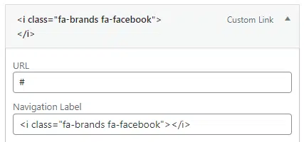
Making your icons accessible is quite simple by just adding a title attribute. For example:
<i class="fa-brands fa-facebook" title="My company's Facebook"></i>There are several ways to do this. Things like adding screen reader text. But this method is probably one of the most straightforward.
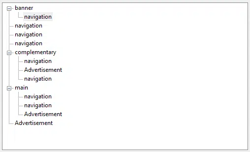
Duplicate nav landmarks without labels
It’s not uncommon to have multiple menus on a site (header, header secondary, footer, footer secondary, and so on). On a code level, most of these will be wrapped in a <nav> tag which is automatically documented as an element landmark. Landmarks make navigation easier for keyboard users, allowing them to jump to elements on a page using shortcuts. However, if the landmarks don’t have unique identifiers, it’s not clear to screen reader users which navigation landmark they’re jumping to:
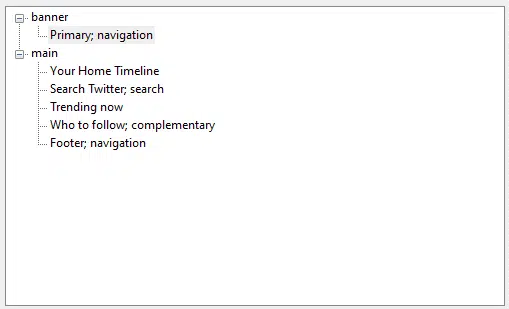
However, if the navigation menu has been given aria, people will actually know what they’re clicking on:
In basic HTML, it will look something like this:
<nav aria-label="primary">[menu]<nav>There’s no need to say something like “primary navigation” as a screen reader would already read that out loud. So if you’re creating a menu from scratch, your code would look something like this:
This goes in functions.php and registers the menu:
This goes in functions.php and registers the menu
function bhm_landmark_menu() {
  register_nav_menu('bhm-landmark-menu',__( 'BHM Landmark Menu' ));
}
add_action( 'init', 'bhm_landmark_menu' );
This goes in the template and controls output:
wp_nav_menu( array(
	'container' => 'nav',
    'theme_location' => 'bhm-landmark-menu',
    'container_class' => 'bhm-menu-class',
	'container_aria_label' => 'footer secondary',
	) );
Mind you, this is a very basic sample. You can find all attribute values in the WordPress developer codex.
Improve Your SEO Rankings By Making Your Navigation Menu Accessible
Your website’s accessibility is an essential factor when it comes to your website traffic thus immediately impacting your SEO rankings. Therefore, it’s vital to confirm that you aren’t blocking any potential customers from visiting or navigating through your site! By taking the time to improve your accessibility, you’re not only increasing the number of users who can view your content. But you’re also creating a simple way to stand out from your competitors and rank higher on Google.
Now, are you all in on making your navigation menu accessible?
Our Accessibility Maintenance Plans help you remove barriers for people with disabilities and meet legal requirements with confidence.