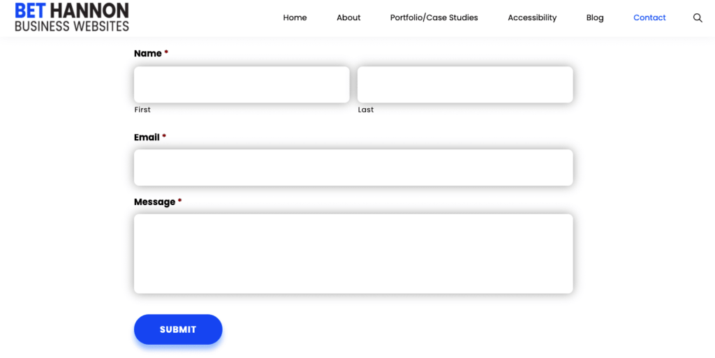
Almost every modern website includes some kind of form — whether it’s just a basic contact form or something more complicated, like a multi-page survey or an order form that handles financial transactions.
The most interactive elements on your site — including forms — are likely places for visitors to encounter accessibility problems. For that reason, forms deserve special attention when it comes to accessibility.
Whether you’re just inserting a code from a plugin you downloaded or are building one yourself, you’ll need to follow a few best practices to make sure that everyone can access your form.
In this article, we aim to clarify how both professionals and non-professionals can make a form that’s accessible to everyone who wants to use it.
Look for These Basic Accessibility Mistakes
Here are things that even non tech-savvy people can check to make forms easier to use:
- General Clarity – Sometimes accessibility has nothing to do with ability levels or specific disabilities: All people appreciate forms that are easy to scan visually and that have clear instructions for each field. If the form makes your website visitors confused, or you find that they’re skipping it whenever they can, you can probably redesign it to make it shorter, or reconsider how you’ve labeled the fields and buttons.
- Error Messages – When the form rejects an input for any reason, there should be a clear text description of what needs to happen to fix the mistake and fill out the form properly. Again, this one is as important for people with disabilities as it is for people without them. Ideally, the directions for each form field will prevent mistakes if they make the criteria for each field clear upfront (for example, required password length, special characters, or date format).
- Easy Navigation With Keyboard Only – If you’re new to accessibility issues, you may not know how important it is not to force website visitors to rely on a mouse. If you can’t navigate through fields and pages using the TAB key, you definitely have an accessibility problem. That includes things like closing error messages and going both back and forward to make changes and adjustments.
- Ease of Use Across Browsers – A web form that’s only accessible on one or two browsers isn’t truly accessible. It takes time to check and make sure that the form works on all major browsers, but it’s an important step in your accessibility efforts.
Make Sure Your Programmer/Designer Gets Things Right Behind the Scenes
Here are things that people can check for on their web form with just a bit of programming knowledge:
- Field Labels – Field labels tend to cause the most backend accessibility issues for webforms that are built from scratch. From the front end, you may think that a “label” just contains more information about the field being filled out. However, on the back end, “label” is an HTML tag that serves to link the tag to the field, and makes it easier for people to select the corresponding form field. Some programmers may think they can skip the label field in various ways, such as by using CSS to make the labels look a certain way, using inappropriate tags like “table” or using other inappropriate HTML elements such as DIV and SPAN.
- Field Sets – Using the “fieldset” tag in HTML clarifies to screen readers (the devices that blind people use to navigate websites) which options belong to which field. This is particularly important for fields with multiple input options, such as checkboxes or radio boxes. The field set tag can also be used to group multiple form elements into related sections, which is, again, important for people using screen readers to access your site.
- Color Contrast – People with colorblindness or other visual disabilities can have a difficult time distinguishing from among certain colors. A good programmer will know how to check color codes to make sure they fall within an accessible spectrum. We wrote a full post on the topic here: Website Color Contrast: How to Check For It
- Field Focus – It should be easy for any form user to be able to tell how much progress they’ve made on the form so far — and which field is actually active at any moment. This can be accomplished with a clear colored border to indicate the active field — something your programmers should know how to add.
- Fonts – Certain fonts don’t show up for screen readers at all — on the back end, they show up as a series of rectangles. Your programmer should know not to use icon fonts anywhere in a form.
Don’t Mess With a Good Thing
A decade or so ago, most people were still building their own web forms themselves with code, but these days, there are lots of plugins and tools on the market that make it easy for even non-programmers to add forms to their site.
Because the companies that build these tools specialize so exclusively in providing web forms, they’re usually fully aware of common accessibility issues that can arise in form building — in fact, they may well find themselves in legal trouble if they were to build a tool that was difficult for disabled people to use.
Everyone should be able to use the web and web forms, regardless of device or ability…We want everyone to be able to use our forms, and we want site owners to be able to comply with government laws on accessibility, regardless of which country they live in or where they visit a website from. This accessibility statement is to let you know the goals we aim for, the work we have done, and what we are planning to do around accessibility for our Gravity Forms products.
Gravity Forms Commitment to Accessibility
For example, at AccessiCart, we use Gravity Forms, a form builder plugin that is fully accessible.
However, there is still potential for accessibility problems when using these plugins, mostly from people who know just enough to dabble with a form’s code but don’t have in-depth knowledge of how those changes will affect accessibility.
In fact, we’ve found that most of the time when a form has accessibility problems, it’s because someone has modified a form that used to be accessible out-of-the-box and tweaked it in some way.
As a general rule, you shouldn’t add custom code that changes functionalities to a webform plugin unless you know how to make sure you keep the form accessible. Most modern form plugins have plenty of features that allow you to completely customize the form with the designated editor, which was designed to make these changes safely.

Our Accessibility Maintenance Plans help you remove barriers for people with disabilities and meet legal requirements with confidence.